We all want a faster pagespeed. Not only does it help your bounce rate go down, it gives the reader an entirely better experience when they can, uhm, actually GET TO your page without lengthy loading times!
The Sure Fire Way to Improve Your Pagespeed
I’ve recently been working on my own pagespeed optimization, trying to see how I compare to others, if mine is on point, is it too high or is it lower than average. I pulled a lot of metrics. I pulled the site speeds of my friends in my niche.
My favorite sites to pull pagespeed and get insights from are:
Here’s how I personally ranked before I got started:
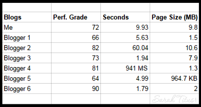
According to Pingdom, my website performance grade was 72 and my homepage page size was 9.8 MB. My pagespeed was 9.93 seconds.
Comparing my blog to others in my niche, here’s how we all ranked…
Looking at their data and seeing which bloggers had the lowest pagespeeds, both of them have a basic page as their homepage. So you go to this basic page and then if you want the blog (their most recent posts) you have to click “blog” in the top navigation bar.
I think this is really smart for a few reasons:
• Most readers will find that homepage very helpful. So, they will naturally click something to get in. It’s not a dummy page. It’s useful. Think…the map in the mall. You don’t know where anything is, you have a welcome map. This gets you to your destination quicker and is something that I plan to carefully consider if it’s right for my site in the future.
• It helps pagespeed because the pictures on the first page are all static. Whereas the pictures on MY homepage, change as often as I post a new post. Because it’s always changing and rotating, the server has to get the data again and again and again for every element that’s changed. A static page, doesn’t change. Therefore, it’s a lot faster to load because there’s nothing more the server has to get. The pictures are the same, so it can used the cached ones. This makes the site load much faster.
• Since the page is somewhat like a map, not only is a newsletter presented (which is better than a pop up and everyone who clicks that page sees it), but it also has links to get to where they want to go. This increases clicks = traffic.
Think about it, let’s say you get 20,000 pageviews a month to your homepage. Each one of those people click “blog” in the nav bar, that means, just that one change you’ve made, you’ve increased your traffic by 20,000 pageviews/month. I know that may not SOUND like a lot, but I’ve been able to increase my traffic monumentally, by studying out little tweaks JUST like this. Over time, those changes DO really add up!!!
• Both pages have a video on their homepage. I’m not sure exactly how that helps, but it is a pattern. Perhaps, they want to welcome you. Perhaps it’s to get more connected. Perhaps it’s just for fun. Whatever the reason, both sites (who are completely different topics might I add), have this element, so it’s worth mentioning.
How to know if your pagespeed is normal
To find out how your own pagespeed ranks and if it’s normal, I would follow the same steps I did.
On each of the sites listed above, pull the stats for you and 5-10 other bloggers in your space. You want to pull the TOP bloggers in your space because you always want to be gleaning information and patterns from those that are successful.
Then, put all the data in order. Which site ranks first, second, third, all the way to the end. Where are you on that list? Are you at the bottom? Somewhere in the middle? Are you at the top? This will help you determine where you fit in.
- If you’re at the bottom, for example, you’ve got work to do.
- If you’re at the top, awesome, you’re doing great.
- If you’re in the middle, try to find patterns like I did for the top bloggers to increase your pagespeed time.
Once you know where you’re at, begin working on each element that Google suggests on this site here. What I love about the Google pagespeed insights tool, is that it’s BY Google, which is the exact platform we want to get better at. Of course, we all want more Google traffic right?! Well, they are telling you EXACTLY, step-by-step, what to do to get better ranking with them and how to get your pagespeed better. Seriously, how cool is that?!
Okay, I know what you’re thinking, “So, what exactly affects my pagespeed?” Great question! Here are some of the things that affect your pagespeed.
Some things that affect your pagespeed are:
- Pictures
- JavaScript
- CSS coding
- Hosting
- Plugins
- Caching
Let’s look a little more in detail at each one of these areas…
Pictures
This is an area that you have to decide if it’s right for you. You have to weigh: less pagespeed or better images. While the experts claim you can’t see a difference in the images that are condensed, compared to the regular images, I guess I have better eyesight, because I can. I learned a long time ago on eBay that a picture is worth a thousand words. Pictures are king in any arena, whether on eBay or a blog.
So, for me, I choose NOT to condense or optimize my pictures. GASP, right!
A lot of my traffic is Pinterest and so, the optimized Pinterest picture is 1200 px X 1800 px and that is what I use. On my actual site, I do reduce the size to no longer, vertically speaking, than 750 px. But the original pictures are all 1200 px X 1800 px. It’s something I’m personally not willing to change, even if it means a higher pagespeed. My site is still very much optimized and my pagespeed now is great, so for me, it’s a fair trade off.
For you, that may be a different story and if it is, I’ll show you how to optimize your pictures so that you can have a faster loading site.
If you’re on a PC, you’ll want to use Compressor.IO. If you’re on Mac, you can use ImageOptim.
For Compressor.IO – Every picture that you upload to your site, you’ll first want to upload it to the picture compressor before doing so. Normally, you’d choose the “Lossy” option. If you want to maintain as much of the image quality as you can, you’ll want to select “LossLess.”
Let’s say you have a static page and you want to keep all your images for your posts high quality and not compress the images, but you DO want to compress the sidebar images. Things like an ad for your eBook or a picture or even your popular posts images on the sidebar, depending on whether your eyesight is good or not (LOL) and depending on the quality of the pictures you want, you can select “LossLess.” It still gets you good quality images, and you’re still compressing them to a smaller size.
This helps your pagespeed because your homepage is now optimized on the sidebar, which is half your homepage basically. Now it’s just the post pictures sucking up resources. While it won’t be THE fastest, it’s still helping…and every little bit helps.
Sidenote: If you’re looking for amazing pictures for your blog, the site I use is BigStockPhoto. They have great pictures and are attribution-free, which is VERY important.
JavaScript and CSS coding
While you are looking at the Google pagespeed insights site, it may say something like: “Eliminate render-blocking JavaScript and CSS in above-the-fold content.”
Without going into too much detail, because honestly, I’m in no way a technical guru – there are some JavaScripts and CSS coding that you have on your site that until those render completely, you’re site won’t show.
Now, to get a little more technical, your ads that you display on your site, you always want to chose “Asynchronous” rather than “Synchronous.” What this means is that the page will load when it’s ready and the ad won’t hold up the page from showing. If you chose Synchronous, the page itself won’t load until that ad has loaded as well. This can lead to having people leave your site because they don’t want to wait for the ad to load.
But this doesn’t just apply to ads. There are a lot of things it can apply to. In your header, sometimes there is coding in there that can hold up the page as well.
So as much as depends on you, you want to eliminate that render-blocking codes. You want the page to load and not be hung up on something. That’s basically all that means.
In order to do this, you want to have a technician help you install a plug in. The plug in can greatly improve your site’s speed. There’s some coding that sometimes has to happen, so I wouldn’t suggest just installing the plug in without help from an expert, that is, unless you’re technical and know what you’re doing.
The plug in is called “Autopimize” and the description says it all. It “Optimizes your website, concatenating the CSS and JavaScript code, and compressing it.”
Just this ONE trick made my score in Google pagespeed insights to go from a 51 score in mobile to a 62 score in mobile and from a 61 to a 65 on desktop! The higher the score the better in these stats, so this is awesome!
Once you get those things set up, your site should already be loading a lot faster, BUT…there are still other things to consider….
Your host
Listen, if your host sucks, there’s not a whole lot you can do to make your pagespeed better. You can fiddle around with it, and get it a little better, but it’ll never be where it should be with a gucky host.
So, let’s talk hosts for a minute.
If you have a blog, you can think of your blog like building a house.
- The foundation to put the house on…is the host.
- The wooden frame and studs of the house is WordPress.
- The drywall, so that you have walls, is your parent theme (in my case, I highly recommend Genesis).
- The paint color to those walls is your child theme (in my case, mine is personalized specifically for my blog, but a few of my favorites include…Restored 316 themes and Modern Blogger Pro).
- The furniture in your home is the plugins on your site.
Once you have all of those things in place, you have a home. Well, I guess water and sewer aren’t in that list, but…LOL, you know what I mean. 🙂
Without your host, the whole house has NOTHING to stand on. And mark this, the foundation is what directs what the house will be.
When you first start out in blogging, you’ll want to get an apartment. You’ll share your host with hundreds of other tenants…bloggers, in this case. Each person has a little bit of resources, but if one person in your apartment complex has a fire, it affects everyone, right?!
Same with hosting!
If one blogger starts getting a spike in traffic, YOUR site suffers. Because it’s ONE apartment complex. It’s ONE server and there’s only so much space on THAT server.
Once you get up to about 200,000 pageviews/month, you’ll need to move out from your apartment complex and into a townhouse. Townhouses generally have about 1-5 tenants, not hundreds. So, your server space is quite larger, but…you’re still sharing. If one blogger has a traffic spike, you suffer.
A FANTASTIC host to get you through all of that is Bluehost. They are amazing, very cost effective, and the customer service is far to none!
However, once you get past around 500,000 pageviews/month, you’ll need your OWN house. You need your own server. By that time, you are flying and it’s only a matter of time before you double those pageviews and are onto a million in traffic per month. You cannot share resources with someone else at this point.
Yes, the “rent” is higher, but you get what you pay for and it’s a part of being successful in blogging and making more money. There are costs. Is it worth it? Absolutely! I pay about $130/month and that includes daily backups. My host is the best host in the world and it’s a Christian company, so I know that I am really being taken care of and that the morals are high. I’ve worked out a deal with them that you get…….$15 off your first month with them when you switch. And there’s no paying upfront, so if you hate them, you move. It’s that simple, but I guarantee you won’t hate them! Just click here to go to their site and use promo code “TITUS” to receive your $15 off. Easy peasy!
Did you think that was it? Think that I’m just giving you a little bit of information to sell you something? Nope, not my style. In fact, I just lost $2,600/month by taking off a ton of ads off this site. Why? Well, because they are annoying, right?! I’m not about the money, trust me. I’d be rich if I were!
Rather, my passion in life is to help others. SO, let’s continue!!!
The next thing you want to take a look at when you’re trying to reduce your pagespeed is plug ins.
Plug ins
Plug ins quickly drain your pagespeed like crazy! Even if they are plug ins for your own benefit and a visitor never even sees them (like one of my fav’s, Heatmap), it’s STILL affecting your visitors experience!
There are plug ins that drain more resources and there are some that are light and don’t drain as much.
The best thing to do is to go through every single one of your plug ins and see if it’s absolutely necessary. This is something that I do routinely! During this time when I am trying to boost my pagespeed, I have deleted 11 plug ins! Believe it or not, 4 of those came from ONE ad company. The ad company making me $2,600/month. So, by deleting that all off my site, not only did I reduce drastically the amount of ads you have to deal with, but the site is faster too! Booyah! Double score!!!
Now, you can’t delete everything. There are some plug ins that you need and some more that you will want, in order that your site be beautiful and give certain options to your readers. But, don’t forget that if you have a technician or designer, many of the plug ins can be hard coded into your site. This is ideal because you’re still getting the benefits of the plug in, but it’s not taking up as much space as a plug in.
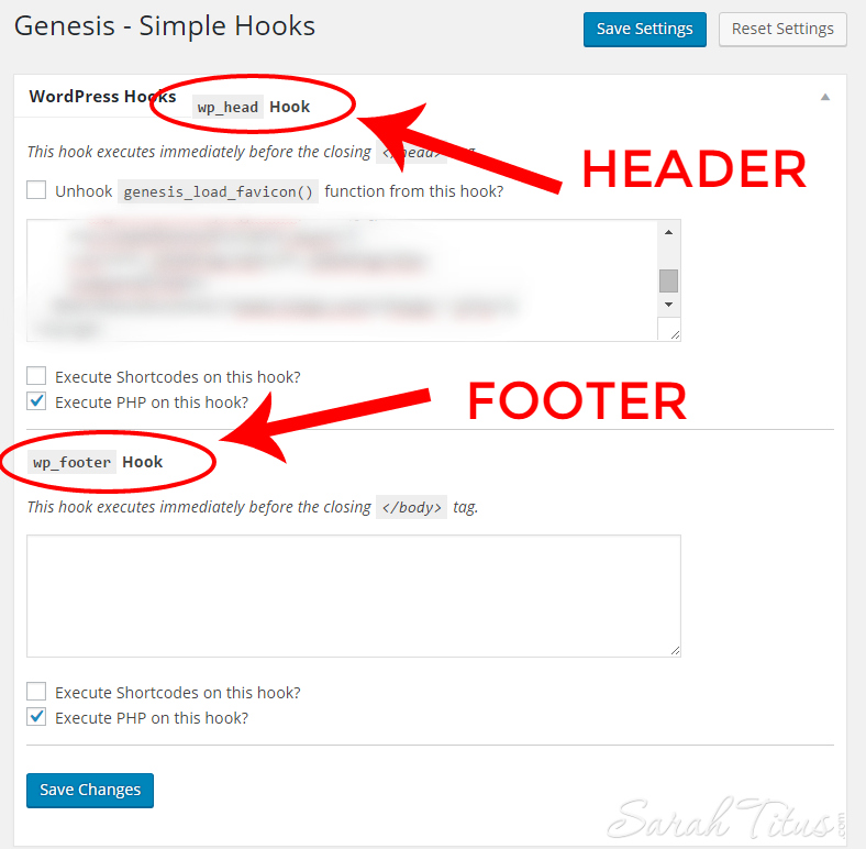
One of the great things about having Genesis (other than their amazing theme and killer SEO package) is their ability to wrap plug ins into your theme with CSS coding. In order to do this, you just install the “Simple Hooks” plug in. So, it’s ONE plug in extra instead of how many ever you have. It has places in there to put coding in the header, in the footer, and a ton of other places, so you can customize it all yourself!
Say, you are activating your Pinterest account, right. They want you to put in some code in your header. Instead of hiring someone and paying them to place that code in there, all you have to do is put the code in yourself in your Simple Hooks. Here’s a screenshot…
It really couldn’t be simpler. And there you have it, Pinterest is installed and verified on your site!
While plug ins are great to configure and delete, there’s one more very important step that you CANNOT forget…
Caching
Caching is basically the internet taking a picture of your content and serving that to your visitors rather than uploading and downloading the same content over and over.
For example: your sidebar. It rarely changes and so, instead of your visitor having to upload and download each item on your sidebar, the server can remember that it’s the same image as before, and serve that. It’s the same exact content, at a much faster speed.
Where hiccups come in, is when you change something major on your site. Examples:
- Let’s say you do a site redesign, you’ll want to go in and delete your cache, so that your readers are seeing the new site rather than the old one.
- If you put up a book promo and you want them to see it, be sure to delete your cache so they can see it.
- If you change your navigation bar, delete the cache.
Other changes, minor changes, you can just leave them alone. It’ll update automatically soon.
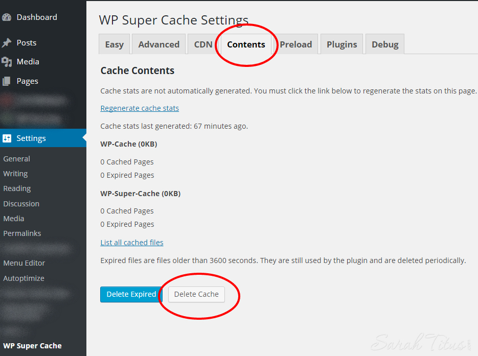
There are a couple great caching plug ins to choose from. The two that I’d recommend are: WP Super Cache and W3 Total Cache. Either one will work extremely well for you.
If you’re using WP Super Cache and you want to delete your cache, simple click Settings on the black sidebar to your right in WordPress, then WP Super Cache. Then click the contents tab, then delete cache. Here’s a screenshot to help you recognize it.
After all is said and done, with still more to take care of and the future thought about putting up a static homepage, I’ve successfully reduced my pagespeed…
FROM:
According to Pingdom, my performance grade was 72 and my homepage page size was 9.8 MB. My pagespeed was 9.93 seconds.
According to Google pagespeed insights, I had a 51 score in mobile to a 61 score desktop.
TO:
According to Pingdom, my performance grade is now 75 and my homepage page size is now 1.9 MB. My pagespeed is now 3.55 seconds. I shaved off 6.38 seconds!!!!
According to Google pagespeed insights, my score on mobile is now 62 and on desktop, it is now 65.
To me, that is totally worth it. It doesn’t really take all that much time if you know what you’re doing. Hopefully this extensive guide will help you shave off time on your pagespeed as well. If you found it helpful, I’d love it if you shared it with your friends and colleagues. Not just so that I can get traffic, but rather, so that when YOU are visiting other sites, it won’t be quite as annoying to sit there and wait for their page to load. Nothing is worse than going to a site, excited to read their content piece, and you sit there and wait…and wait…and wait…
Let’s get the word out and fix that!
Do you have any ideas or tips to share to improve your pagespeed online?
